The start of a new year reminds us that the world is constantly in flux: time passing and things changing. That includes, of course, even our most recognizable corporate logos! Yes, with each day's passing comes the opportunity for another icon to be tweaked to (hopefully) better tantalize our eyes and pique our purchasing interest. In 2014 alone, Chapstick ever-so-slightly changed their font, Southwest got rid of their plane and Pizza Hut decided to look like a name written in a splatter of sauce.
As an homage to years gone by, we've picked ten of the world's most recognizable brands and taken a look at how their logos have changed over the years. Appreciate what you have now; it could all be gone in an instant! And by "gone," we mean they might change that mermaid on your Starbucks cup's hair a teenie bit…
1. Coca-Cola
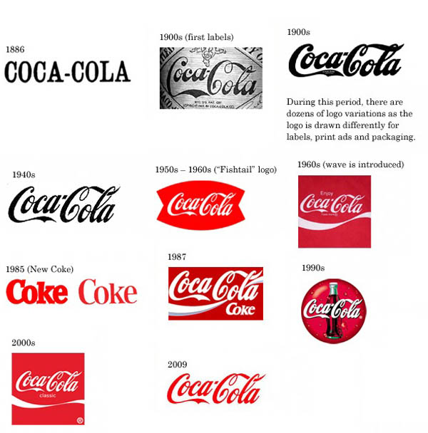
Coca-Cola is one of the oldest and most recognizable brands on the planet. In spite of — or maybe because of — that longevity, the company's logo has changed regularly. However, with the exception of a brief change in the '80s, they've always maintained their classic cursive font. Maybe that's the real reason no one liked New Coke!
2. Pepsi
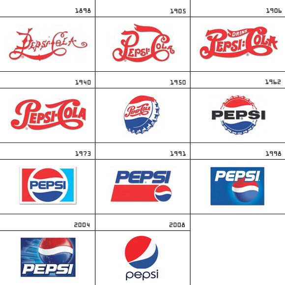
Unlike Coca-Cola, their chief rival, Pepsi, has made far more drastic changes over. However, since World War II, the soft drink maker has maintained their red, white and blue color scheme as well as their signature ball shape. Fun fact: That ball is actually called the "Pepsi Globe."
3. Starbucks
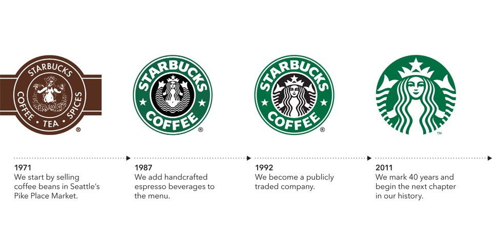
Compared to Coke and Pepsi, Starbucks is a far more recent entry into the "globally recognizable drink brands" category. But now, that green beacon of light shines bright for caffeine addicts almost everywhere. At the center is the Starbucks Siren (don't call her a "mermaid"!) who you'll notice we've seen less and less of in every new incarnation of the logo. Internet jokers like to jest that by 2060 all we'll see is a closeup of her nose. Eh, as long as they've still got Fraps, who cares?
4. Apple
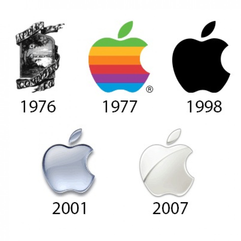
Much like Starbucks, Apple is another brand that has infiltrated our lives at an alarming speed (by, you know, kinda-oldish-people standards). Those of us who remember what it was like to bring home your family's (literally) "first" computer probably have fond memories of an Apple logo that was garishly rainbow-colored. Everyone else is probably wondering why no one texted Steve Jobs back in 1977 to tell him all those colors looked ridiculous.
5. IBM
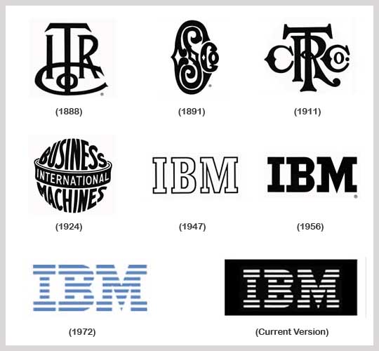
Much like Apple, IBM has had its ups and downs over the years. But unlike Apple, IBM has a legacy that spans 103 years — even longer if you trace its roots back to the International Time Recording Company (which is the first logo you see here). Yup, one of the world's most famous computer companies started out making clocks. No wonder they needed a few logo changes.
6. Walmart
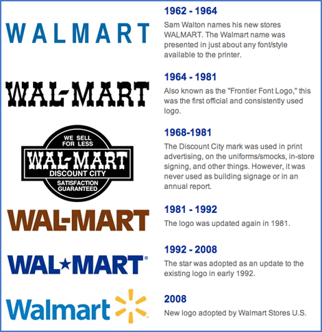
Throughout the '80s and '90s, Walmart quickly grew to become one of the largest retailers in America. It's logo grew with it, becoming a big, thick block font. Not surprisingly, when people started to complain about the retail giant's lack of a friendly side, Walmart decided to start taking it easy on all the bold. It's amazing how a logo truly can tell the history of a company.
7. Shell
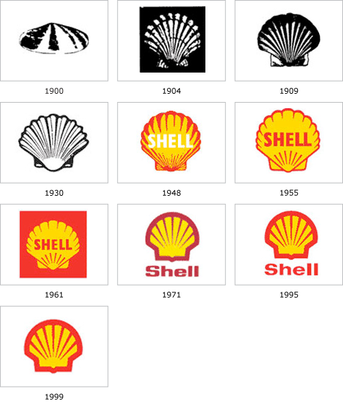
If you're interested in the number of iterations of a company logo, Shell Oil has been through plenty. The shell itself started out with a surprisingly lifelike graphic depiction before evolving into the more abstract version we see today. The final step was getting rid of the word "Shell" altogether, because by now you've figured out that it isn't a drive-up sushi restaurant.
8. MasterCard
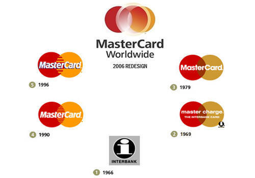
One set of logos you're always on the lookout for is credit card companies — because lord knows you're not carrying any cash in this day and age! MasterCard has stayed relatively consistent, even back in the olden days when it was called MasterCharge. (Ha! MasterCharge.) But one thing you might not know is that, back in 2006, MasterCard changed their corporate logo, yet decided to leave the logo that's actually on their credit cards the same. Sneaky!
9. McDonald's
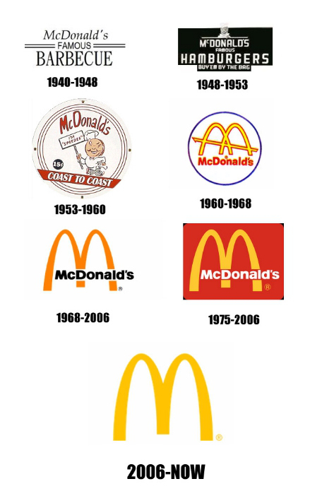
When it comes to recognizable worldwide brands, no one come close to competing with McDonald's! Part of what's worked for them is their ubiquitous "Golden Arches." Surprisingly, the iconic arches weren't incorporated into the company's logo until 1962. Before then, people just said, "Look for the, um, place with that burger-faced chef guy!"
10. Burger King
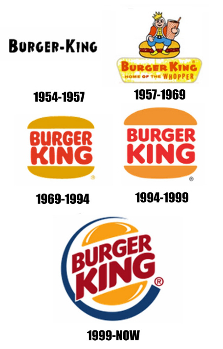
Of course, if we're going to look at McDonald's, we also have to check out what the Burger King logo has been through — which isn't much. Once they stuck their name between a bun, they had something they liked (outside of some font changes and flare adjustments, of course). Interestingly, the company originally started out as "Insta-Burger King."


